The power of colors<
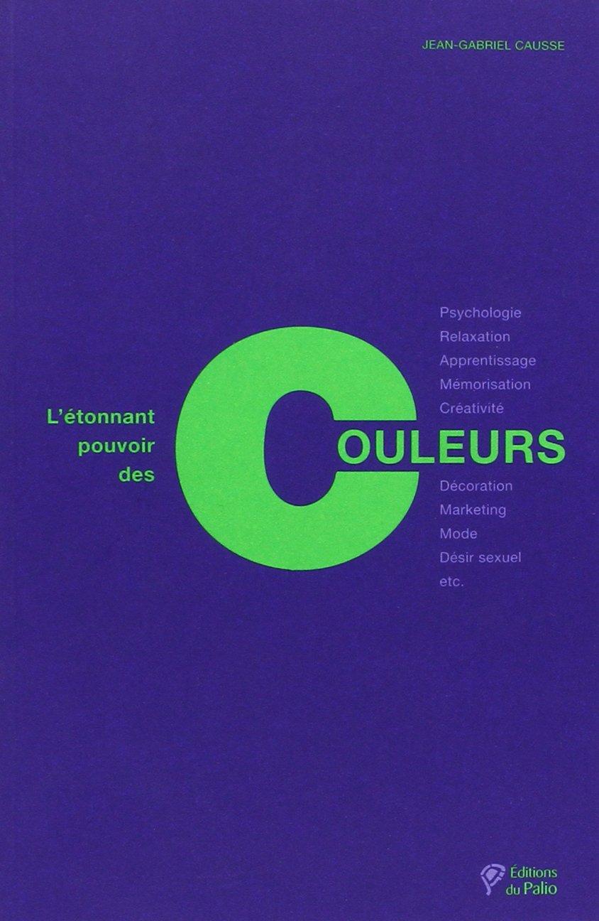
« Osez la couleur! Vous verrez, ça vous fera du bien », lance Jean-Gabriel Causse, designer coloriste et membre du Comité français de la couleur, où il travaille sur les tendances des années à venir. De passage à Montréal, il a profité de la belle saison des couleurs! Rencontre avec un passionné qui nous fait découvrir L'étonnant pouvoir des couleurs, titre de son livre captivant.
Unconscious influences
The colors have a greater impact than we pretend to us.Jean-Gabriel Causse answers the press questions on this subject.
Is the influence of color on us unconscious?
The color does us a lot of good, much more than you can imagine, because its influences are in our unconscious.It was the neuroscience that has advanced our knowledge of the impact of colors.It is not the same areas of the brain that are activated when the colors are cold or hot.
Colors have a real influence on us, whether physiological or psychological.We are in a world that lacks so much colors!For example, you must stop designing offices or classrooms with white and gray walls...It's terrible, white is the color of death.Paradise is white for Westerners.It is in white offices that the risk of depression is the most important.We work there less well and slower.
So colors have real effects and modify our behavior?
Yes.Rose, for example, is a romantic color and the color of optimism and happiness.Researchers have shown that if you pink the walls of kindergarten classes, children's drawings are more positive and more happy.The suns are larger, the clouds less present, the smiles more marked.Children see life in pink!It's very real and this expression takes on its full meaning.
Another demonstration of the effects of pink: Alexander Schauss, scientist and director of the American Institute for Biosocial Research, had pink the walls of the cells of the Correctional Center of the American Navy of Seattle.A 15 -minute exposure to this color is enough to reduce the aggressiveness of the prisoners for 30 minutes.Rose decreases heart rate, blood pressure and pulses.It is a tranquilizing color that lowers aggression, concluded Alexander Schauss.
Is there a color to increase the frequency of sex?
Yes, une étude effectuée en 2012 sur 2000 personnes révèle que, lorsqu'il y a une dominante chromatique de mauve dans la chambre à coucher, il y a plus de rapports sexuels, soit 3,49 par semaine.Red arrives just after (3.18 reports), then white (2.02 reports), beige (1.97 reports), and gray (1.80 reports).
Is red the color of desire and seduction?
Red attracts the gaze and awakens desires.When a woman is dressed in red, it is a formidable weapon of seduction and besides, another woman seeing her arrive will see her as a threat, as if she was going to prick her husband!A woman who makes the thumb that is dressed in red is twice as much like as a motorist (man) stops.A restaurant waitress dressed in red will have more generous tips!
Can color also influence the taste?
Yes.The food industry has understood the importance of the color of its products.You will not buy an egg with a brown shell from an American!And a white shell egg to a French!To judge the good color of a spicy ketchup, we made consumers taste three more or less dark ketchups, but who had the same taste.Result: dark red ketchup was deemed much more spicy than the medium red or light red...Same type of result on children who have tasted fruit syrups with identical taste, but with more or less saturated dyes.The more the color is saturated, the more it seems to have a pronounced taste, which is fundamental to fighting the obesity of children.Just increase the perception of sugar by more bright colors.
Depending on the color we have, will the same discourse be perceived differently?
Yes.For example, if you are dressed in red and you will see your boss, he will see him as a threat to his post, because red is the color of seduction, but also the color of leaders and power.If you are dressed in green, he will see that you have a good team spirit.Red is therefore not recommended if you are in a negotiation, because it is a dominant color.Look at the Obama family during their victory in the 2008 election;Family members arrived on the stage, all dressed in red and black.It is a deliberate choice and a very strong message that meant that they now embodied the American leader family.The red tie is welcome if we want to establish ourselves as a leader!
We live in a world where, in the end, there are fewer and fewer colors?
there are videos How to Learn Swiss German
— babalocken Sun Nov 15 13:17:38 +0000 2015
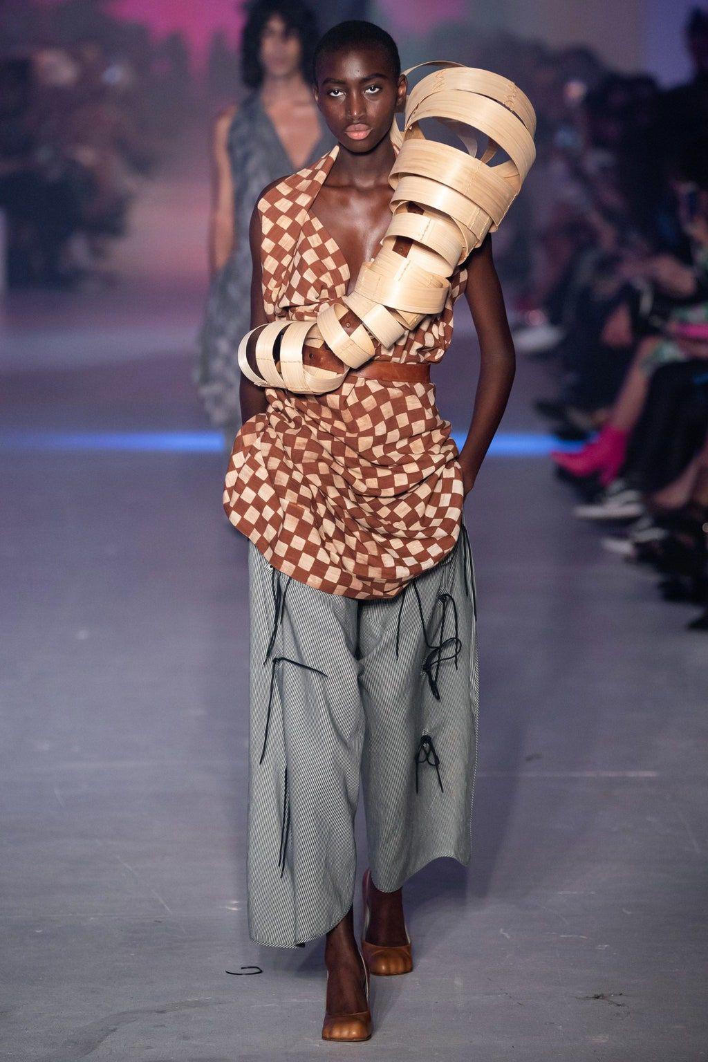
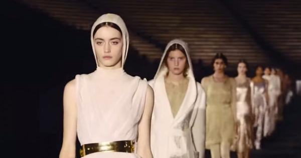
Most of the textile sales in the West always revolves around black, white, gray, ecru and navy blue.While every year, we tell ourselves that people want color to get out of the crisis!There are no more colors!Even if Pantone (color chart) has made "radiant orchid" a clear purple, its favorite color of 2014, we do not see much in the streets.Fashion designers are all dressed in black!At the end of the parades, they arrive in black.The only one who had a little color was Jean Paul Gaultier, who was dressed in his famous blue and white sailor and again, he also got into black!They are the ones who symbolize fashion.Whether in London, New York, Milan, Paris, black took over the color.
Why?
It started with Coco Chanel, who created the little black dress in 1926.At the time, we wore a lot of colors, but the women had the impression that this little black dress refined them and made them thinner, when it is archifals!A dark mass is very imposing.What will really be slimming are the vertical stripes and all that will blur the silhouette, like flowers and patterns.In our unconscious, wearing black, it thinks us, it is a very strong feeling that we have, when reality is quite different.And it's also because black is chic and it's the basis of style.While wearing color will cheer you up.Try it yourself!
Finally, what colors should you have at home to be good?
Having a balance of all colors per touches is what I recommend.If, in your apartment, everything is white and you paint a wall of your living room in orange, obviously you will tire.But if you have an orange wall in the living room, a yellow wall in the kitchen, a little blue in the bathroom, it will be.If, unconsciously, you recreate all the colors, what our parents and grandparents were doing with the wallpaper, there will be a balance and you will not get tired of it.The more complementary colors there are, the more balanced it will be and the better you will wear.
Choose the right color
Each color influences our perceptions and behaviors.Here are eight extracts from the book The Amazing Power of Colors, by Jean-Gabriel Causse, which explain some specificities.
Blue
It's creative color.Our brain escapes with blue.
It is the color of freedom;a blue sky or the blue of the sea produce a beautiful effect on us.At the sight of a swimming pool in a garden, it feels soothed.It is the favorite color on the five continents.
Blue is recommended in the rooms for those who have trouble falling asleep.It is a harmonious color, but sedative.Ideal color for bathrooms.It is also a shade that we all like to wear and that makes us feel good, hence the success of the jeans.
We have fun in blue, it is therefore a color to favor in points of sale.
The green
It is associated with nature.It is the color of balance, it is a color that reassures and soothes.Green inspires confidence, and recommended in the meeting room to convince a customer.
The billiard carpets are green, it is to calm players and so that they are more efficient.
It is recommended in the kitchens because it opens its appetite.
The Red
It is a warm, activating and energizing color.Color of love and seduction.Red frightens us because it is inconvenience, we can feel that its activating effects are powerful, but that, poorly mastered, they can be harmful.It is the color of desire and it is aphrodisiac.
Red also means ban and scares us innate innate.There are many symbolisms: your banker who tells you that you are in the red!All emergency red buttons that should not be touched...
Red is also the traumatic color of the school.Just look at the teacher's number of red annotations on students' copies.When we make mistakes, red is there to sanction us.Why not correct copies with green?Children would see an encouragement!
Orange
It is a warm color that arouses attention and communication.
Orange stimulates the heart, opens the appetite and reduces digestive disorders.It is a recommended color in the kitchen, in the dining room and in the entrance to welcome visitors.In a professional environment, orange is recommended wherever you have to express themselves.
Brown, brown, beige
Brun is the color of nature in what it has unchanging.It's the color of the wood.It is the color of nostalgia.Color of tradition and authenticity.It is the color of craftsmanship.
In our wardrobe, the brown will give a feeling of tanned skin for Westerners.It is great to highlight colors like pink, turquoise or apricot.
A brown wall seems sad and dirty.
Black
C'est la couleur du deuil en Occident depuis le XVIIIe siècle.This color requires respect.Black is the pinnacle of elegance.For a car, a little dress, a tuxedo.
Black is the best color for high frequency noisy environments of many factories.
The White
It is a neither active nor relaxing color, therefore to be avoided in a dominant in a house.White is the symbol of cleanliness, it is also the color of the void and death.
White enlarges and reflects light in dark rooms.
A place where white can be a good color is that where the feeling of hygiene is important, in industrial kitchens, for example, or in medical offices.
Yellow
The color of the sun.It is a tonic color, hot but not exciting.Yellow is recommended in living rooms, because it brings energy.In the evening, it allows to create warm and cozy interiors.It symbolizes success and joie de vivre.
Yellow helps to concentrate, in particular for intellectual tasks or which require organization.


 Tags:
Tags: Prev
Prev
